Badge Configuration
Note
Required fields are indicated with a red Asterisk.
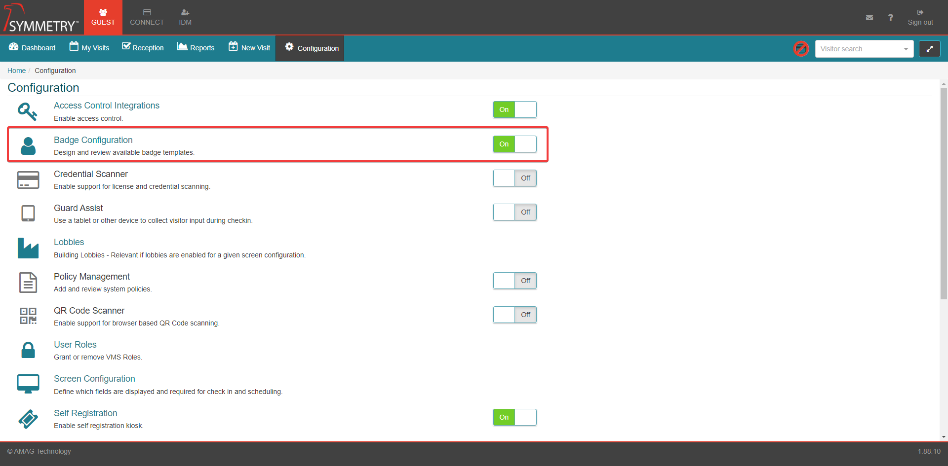
Badge Configuration provides all the tools needed to create a variety of visitor badge designs.
The Badge configuration option can be toggled between On or Off to turn on or off the configuration settings for the users.
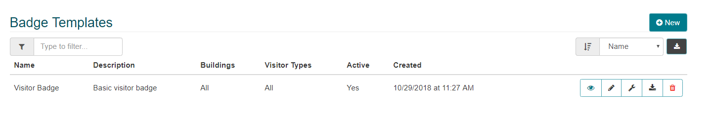
A default Badge Template is provided with GUEST. There are multiple options available for the existing default template.
The list of badge templates can be filtered and searched for by the text to search field, for example by entering the Badge Name or Description in the 'Type to filter box. The list of badge templates can also be sorted (in ascending and descending order) by Name or Description.
Click on the Download icon button to export the badge template list as a .CSV file and be exported to an Excel Spreadsheet file (Excel or an appropriate viewer is required to view the data).
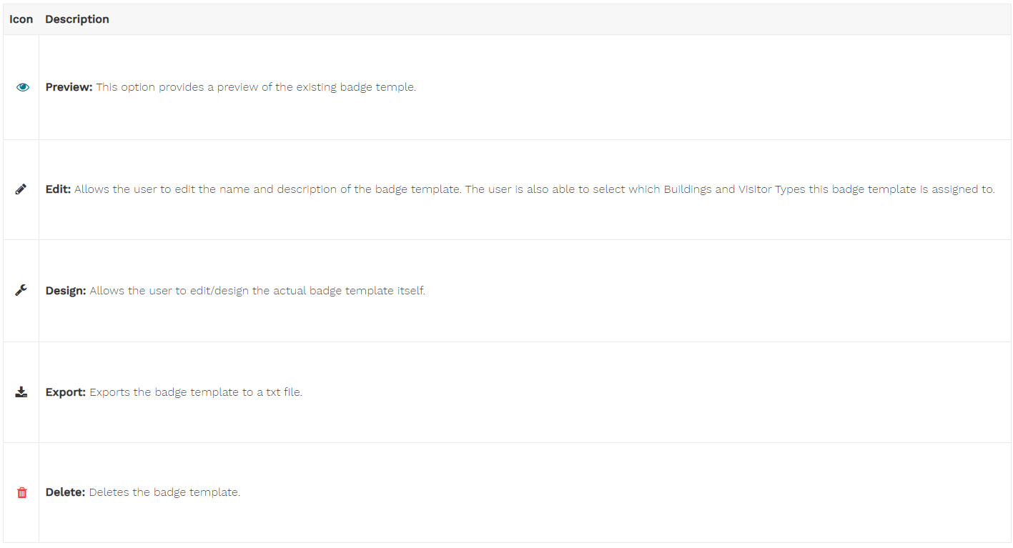
The icon buttons to the right of the badge template are described in further detail below. The options available are:
Preview
Edit
Design
Export Badge
Delete
Preview
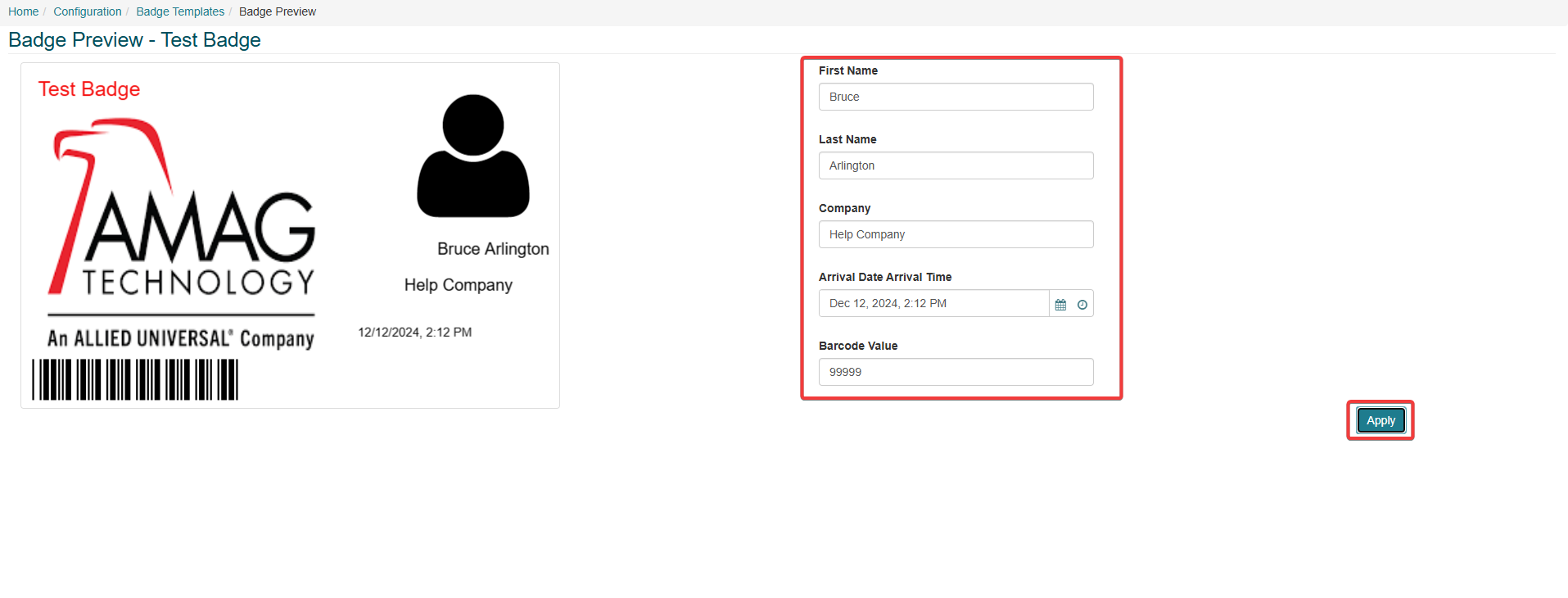
Click the Preview icon button to view the badge template in the finished format.
The user can update the information in the selected data base fields, to be able to view a real time example of the badge template. Clicking the Apply button will add the information provided into the badge template whilst in preview mode.
For example, the data base fields available on this badge template are: First Name, Last Name, Company, Arrival Date and Time and Barcode Value.
Edit
To edit an existing Badge Template, click the Edit icon on the Badge Templates screen.
Name: Badge Name can be edited.
Description: Badge Description can be edited.
Apply to buildings: User can edit which Buildings the Badge Template is assigned to. They can add a single building, multiple Buildings or all Buildings (select the ALL check box to select all Buildings associated with the access control system).
Apply to Visit Types: User can edit which Visit Types the Badge Template is assigned to. They can add a single visit type, multiple visit types or all visit types (select the ALL check box to select all visit types associated with the access control system).
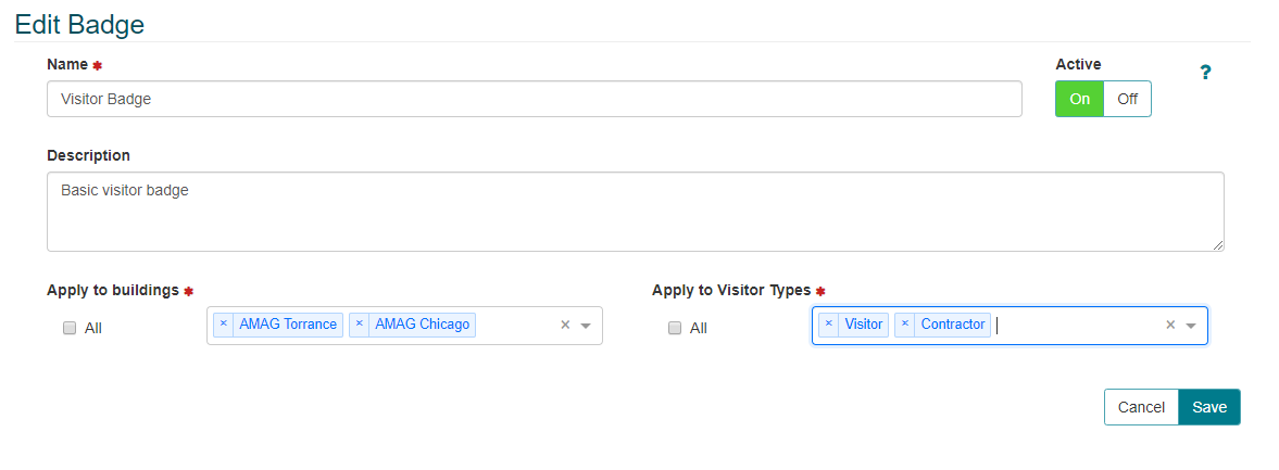
Active: User can toggle Active ON or OFF.
Click the Cancel button to cancel edits to the template.
Click the Save button to save edits to the template.
Design
Click the Design icon to edit the existing badge template or to design a newly created badge template. This is a good place to start with regards to understanding how to configure a template. Click on the existing objects on the template to make changes to them, or drag the objects from the left onto the template.
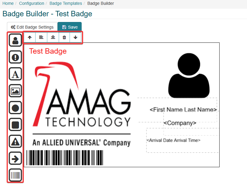
The icon bar at the top of the badge template has 5 tools/settings. These tools/settings control the behavior of each component selected from the icon bar down the left side of the badge template. the options available are:
Bring To Front: Brings the selected component to the front layer of the badge template.
Align Left: Aligns the selected component to the left of the badge template.
Align Center: Aligns the selected component to the center of the badge template.
Delete: Deletes the selected component from the badge template.
Send To Back: Sends the selected component to the back layer of the badge template.
The available components in the badge templates are listed down the left side of the badge template. They can be selected and dragged onto the badge template. Each of these components are editable with a set of options for each component. the position of each of these components can be determined from dragging and dropping into the preferred position. The size of each component can also be adjusted by clicking on the corners of the bounding box and dragging to the desired size.
After every component has been added and/or edited the user must apply the changes by clicking the Save button or click the Cancel button to delete and cancel the update of that individual component.
The available components are as follows:
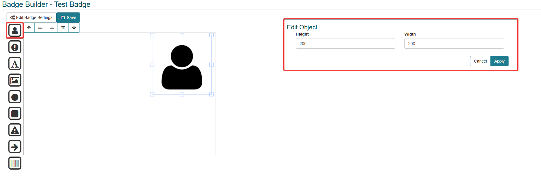
User Photo: The photo of the identity the badge template is assigned to. The height and width is editable in the edit object section.
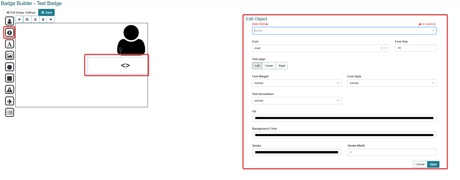
Data Base Text: Data based components can be selected from the drop down list box. There are default options available, and also user defined fields can be added. Several examples of the options available are:
First Name
Last Name
Company
Check-In Date and Time
The selected data base text component can be edited and the following fields can be updated:
Font: Select the required font from the drop down box.
Font size: Select the required font size, either using the up or down arrow or the free type text box.
Text align: Align the text either Left, Center or Right.
Font Weight: Select the required font weight from the drop down box. For example, select the bold option.
Font Style: Select the font style from the drop down box. For example, normal or italic.
Text Decoration: Select the required text decoration. For example, select the underline or line through option.
Fill: Select the fill color, either using the color picker or using the color index. The color index options can be changed between RGB, HSL or HEX.
Background Color: Select the background color, either using the color picker or using the color index. The color index options can be changed between RGB, HSL or HEX.
Stroke: Select the stroke color, either using the color picker or using the color index. The color index options can be changed between RGB, HSL or HEX.
Stroke Width: Select the width, either using the up or down arrow or the free type text box.
Text: Enter the required text into the (click to edit) box. The text component can be edited and the following fields can be updated:
Font: Select the required font from the drop down box.
Font size: Select the required font size, either using the up or down arrow or the free type text box.
Text align: Align the text either Left, Center or Right.
Font Weight: Select the required font weight from the drop down box. For example, select the bold option.
Font Style: Select the font style from the drop down box. For example, normal or italic.
Text Decoration: Select the required text decoration. For example, select the underline or line through option.
Fill: Select the fill color, either using the color picker or using the color index. The color index options can be changed between RGB, HSL or HEX.
Background Color: Select the background color, either using the color picker or using the color index. The color index options can be changed between RGB, HSL or HEX.
Stroke: Select the stroke color, either using the color picker or using the color index. The color index options can be changed between RGB, HSL or HEX.
Stroke Width: Select the width, either using the up or down arrow or the free type text box.
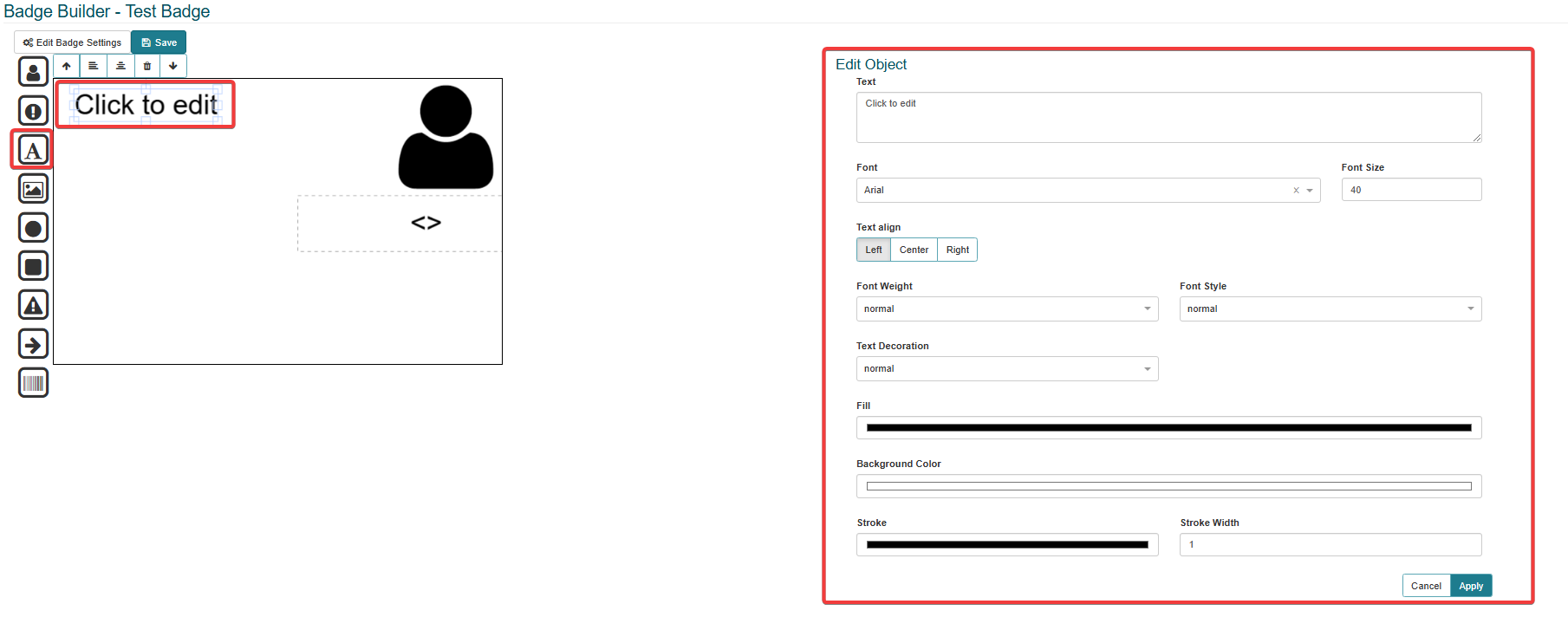
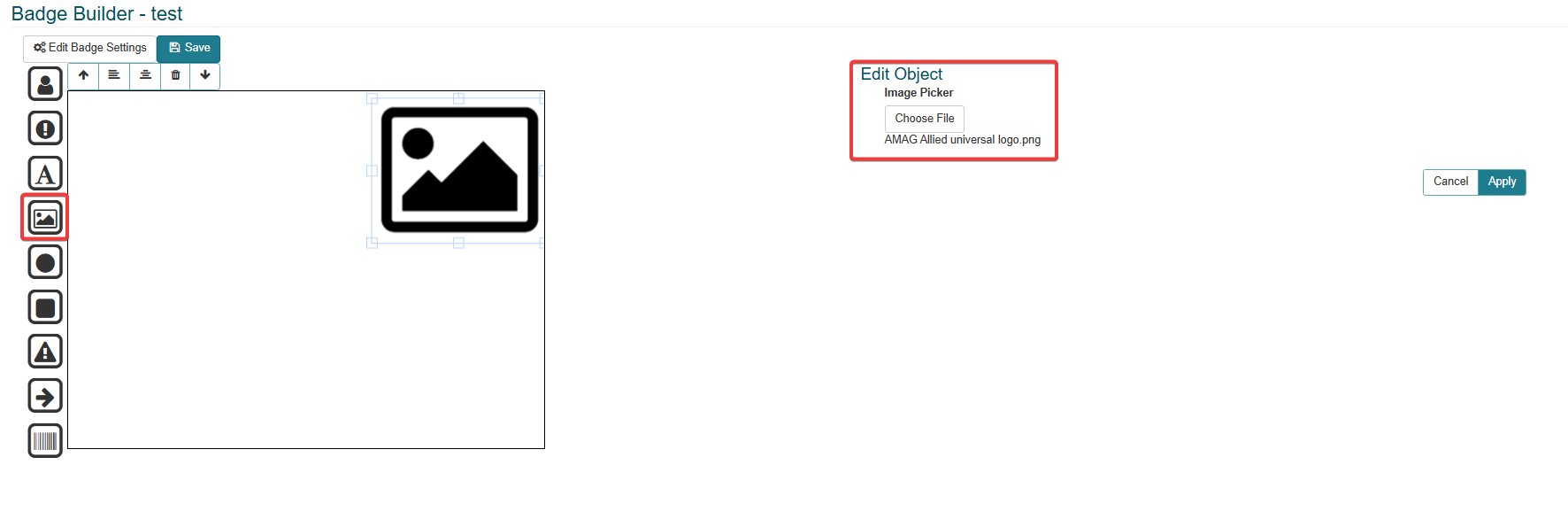
Image: Add an image to the badge template. Click the Choose File button and import a picture into the badge template.
Circle: Add a circle shape to the badge template. This circle component can be edited and the following fields can be updated:
Height: Select the height of the circle component, either using the up or down arrow or the free type text box.
Width: Select the width of the circle component, either using the up or down arrow or the free type text box.
Fill: Select the fill color, either using the color picker or using the color index. The color index options can be changed between RGB, HSL or HEX.
Stroke: Select the stroke color, either using the color picker or using the color index. The color index options can be changed between RGB, HSL or HEX.
Stroke Width: Select the width, either using the up or down arrow or the free type text box.

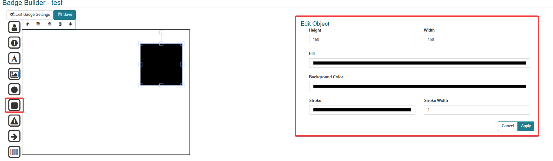
Rectangle: Add a rectangle shape to the badge template. This rectangle component can be edited and the following fields can be updated:
Height: Select the height of the rectangle component, either using the up or down arrow or the free type text box.
Width: Select the width of the rectangle component, either using the up or down arrow or the free type text box.
Fill: Select the fill color, either using the color picker or using the color index. The color index options can be changed between RGB, HSL or HEX.
Stroke: Select the stroke color, either using the color picker or using the color index. The color index options can be changed between RGB, HSL or HEX.
Stroke Width: Select the width, either using the up or down arrow or the free type text box.
Triangle: Add a triangle shape to the badge template. This triangle component can be edited and the following fields can be updated:
Height: Select the height of the triangle component, either using the up or down arrow or the free type text box.
Width: Select the width of the triangle component, either using the up or down arrow or the free type text box.
Fill: Select the fill color, either using the color picker or using the color index. The color index options can be changed between RGB, HSL or HEX.
Stroke: Select the stroke color, either using the color picker or using the color index. The color index options can be changed between RGB, HSL or HEX.
Stroke Width: Select the width, either using the up or down arrow or the free type text box.

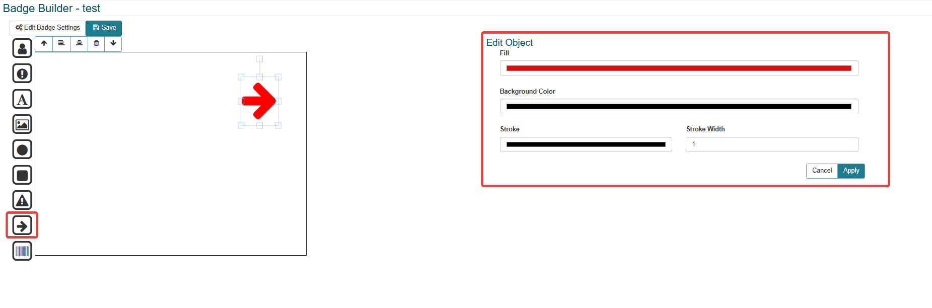
Arrow: Add a arrow shape to the badge template. This arrow component can be edited and the following fields can be updated:
Fill: Select the fill color, either using the color picker or using the color index. The color index options can be changed between RGB, HSL or HEX.
Background Color: Select the background color, either using the color picker or using the color index. The color index options can be changed between RGB, HSL or HEX.
Stroke: Select the stroke color, either using the color picker or using the color index. The color index options can be changed between RGB, HSL or HEX.
Stroke Width: Select the width, either using the up or down arrow or the free type text box.
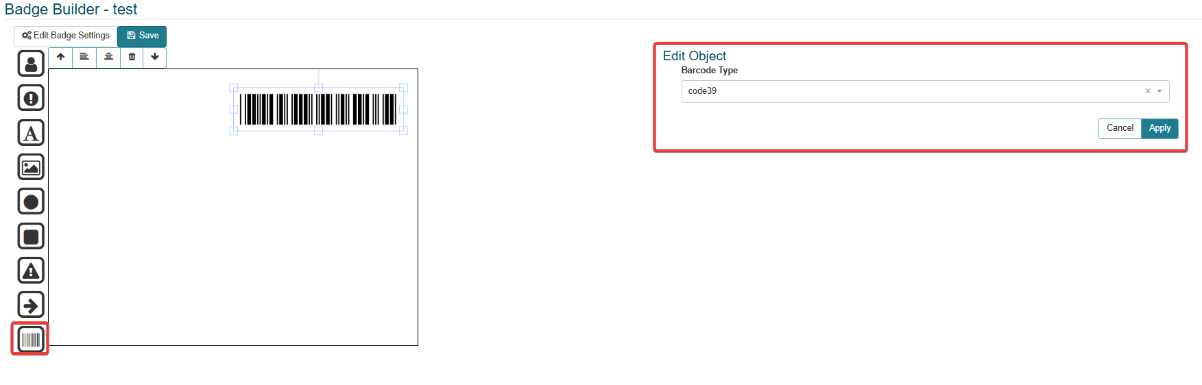
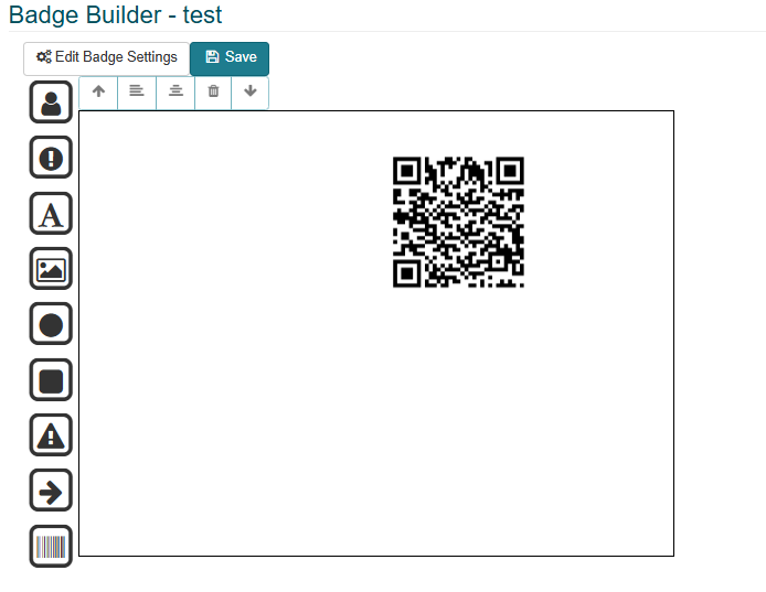
Barcode: Barcode or QR codes can be added to the badge template. By default the component will always be a barcode, but can be edited to be a QR code by selecting the QR code option from the Barcode Type dropdown box.
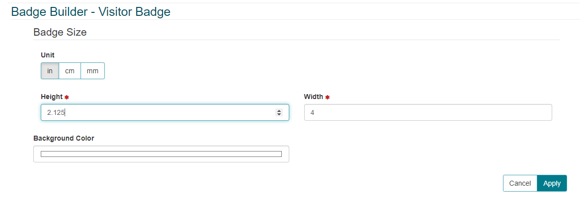
Click Edit Badge Settings button to make amendments to the size and background color.
The height, width and background color can be changed on this screen. Also the unit of measurement (Inches, Centimeters or Millimeters) can be selected. Click the Apply button to save and apply the edits. Click the Cancel button to delete and cancel any updates or edits made.
Click the Save button to apply and save the changes.
Export
Click the Export Badge icon. This will export the badge template as txt file.
Delete
Click the Delete icon to delete the badge template.
Note
Make sure you are deleting the correct badge as the delete function does not have a confirmation step. Once the badge template has been deleted it is unretrievable.
Creating a New Badge Template
Note
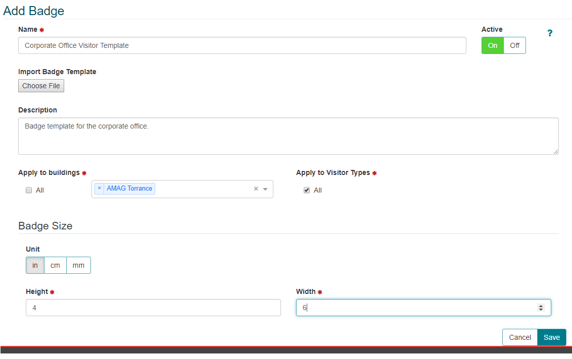
An existing badge template can be imported by selecting Choose File option on the Add Badge screen.
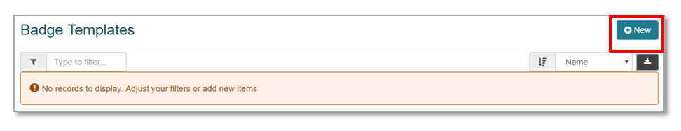
On the Badge Templates screen click New to create a new Badge Template.
Add the Template Name and Description.
Apply to buildings: Apply which Buildings the badge is associated with. The user can add a single Building, multiple Buildings or all Buildings (select the ALL check box to select all Buildings associated with the access control system).
Apply to Visit Types: Apply which Visit Types the badge is associated with. The user can add a single Visit Type, multiple Visit Types or all Visit Types (select the ALL check box to select all visit types associated with the access control system).
Select the badge size. Choose the measurement unit (Inches, Centimeters or Millimeters) and apply the Width and Height.
Make sure the template is Active and click the Save button. Click the Cancel button to cancel the new badge template design.
Then click the Design icon button to allow the badge template to be designed as the user intends. Refer to the Design section above for further details on designing the badge template.
Clicking the Toggle Help (?) icon will provide the user with a useful description of each field.